
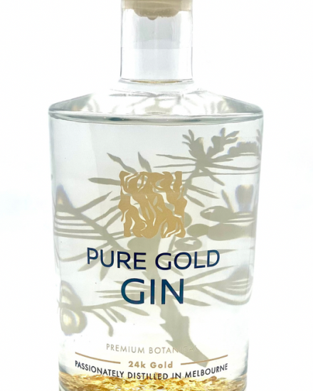
Effective bottle label printing requires more than placing attractive artwork on a container. A label must fit the bottle correctly, present information clearly, remain easy to identify, and support the practical requirements of the product. Small errors in dimensions, typography, artwork preparation, or information placement can affect the finished result and may lead to unnecessary reprints. Understanding common mistakes before production begins can help businesses create labels that are practical, consistent, and suitable for their intended application.
Many label problems begin during the planning stage rather than during production. Businesses may focus heavily on visual appearance without considering the physical bottle, the amount of available space, or how customers will interact with the product. A design that appears effective on a large computer screen may look crowded when printed at its actual size. Reviewing both the design and its practical application can help identify potential issues earlier.
Using Incorrect Bottle Measurements
One of the most common mistakes is designing a label before confirming the exact dimensions of the container. Even a small measurement error can affect how the finished label sits on the bottle.
The usable surface area should be measured carefully. Curves, tapers, raised sections, and changes in bottle shape can reduce the space available for a label. A design that extends into these areas may not appear as intended.
Businesses should also consider whether the label needs to wrap around the container or cover only a specific section. Front, back, and neck labels each have different dimensional requirements.
Working with accurate measurements from the beginning reduces the likelihood of resizing artwork late in the process. It also helps designers arrange text and graphics according to the space that will actually be available.
Adding Too Much Information to a Small Area
Bottle labels often need to communicate several details, but trying to include everything can make the design difficult to read. Crowded labels may contain small text, limited spacing, and too many competing elements.
Businesses should decide which information deserves the greatest attention. The product name and other key details should be easy to identify, while supporting content can be arranged in a secondary position.
Removing unnecessary wording can create valuable space. Clear and concise content often communicates more effectively than long blocks of text.
The final design should be checked at actual size. This is one of the simplest ways to determine whether the text remains readable and whether the overall layout feels too crowded. Viewing only an enlarged digital version can hide problems that become obvious after printing.
Ignoring the Shape of the Container
A flat artwork file does not always show how a label will look when applied to a three-dimensional bottle. Important information can disappear around curved surfaces, while graphics may appear different once wrapped around the container.
The shape of the bottle should influence the placement of key elements. Product names and other important detailsgenerally need to remain visible from the intended viewing angle.
Tapered or irregular containers may require additional consideration because the available surface is not uniform. Businesses should avoid assuming that a design suitable for one bottle will automatically work on another container of a similar size.
Evaluating the label in relation to the actual bottle can help reveal positioning problems before a larger quantity is produced.
Choosing Typography That Is Difficult to Read
Typography can strongly affect the usability of a label. Decorative typefaces may support a particular visual style, but they can become difficult to read when used for small or detailed information.
Using too many typefaces can also make the design appear disorganised. A limited and consistent approach often creates a clearer hierarchy between the product name, supporting details, and smaller information.
Text size is equally important. Businesses sometimes reduce type until all required content fits, but this can make essential details difficult to understand.
Spacing between letters, lines, and separate sections should also be reviewed. Adequate space can improve readability without requiring major changes to the overall design.
Creating Poor Contrast Between Text and Backgrounds
A label may contain all the correct information but still fail to communicate effectively if the text does not stand out from the background.
Low contrast can make words difficult to read, particularly when small text is placed over detailed images or complex patterns. Important information should remain clear under the conditions in which customers are likely to view the product.
Businesses should examine how different design elements interact rather than assessing each one separately. A background image may look attractive on its own but create problems when text is placed over it.
The label should also be reviewed at its final size because contrast issues can become more noticeable when artwork is reduced.
Failing to Create a Clear Information Hierarchy
When every element is given equal visual emphasis, customers may not know where to look first. A label needs a clear order that helps people identify the product and locate supporting details.
Size, position, spacing, and typography can all establish hierarchy. The most important information should receive appropriate prominence, while secondary content can be arranged without competing for attention.
A clear hierarchy is particularly useful when several products belong to the same range. Customers should be able to recognise the overall product family while quickly identifying the specific item they need.
Good organisation also makes the label easier to scan. Customers can find relevant information without reading every element from beginning to end.
Taking more time during the planning stage can reduce avoidable changes and improve consistency across a product range. A carefully prepared label can communicate information more clearly, fit the bottle more effectively, and create a more organised presentation without unnecessary complexity.